

Hokkaidon
Restaurant & Bars Design Awards - Identity winner 2018
Press: Yatzer
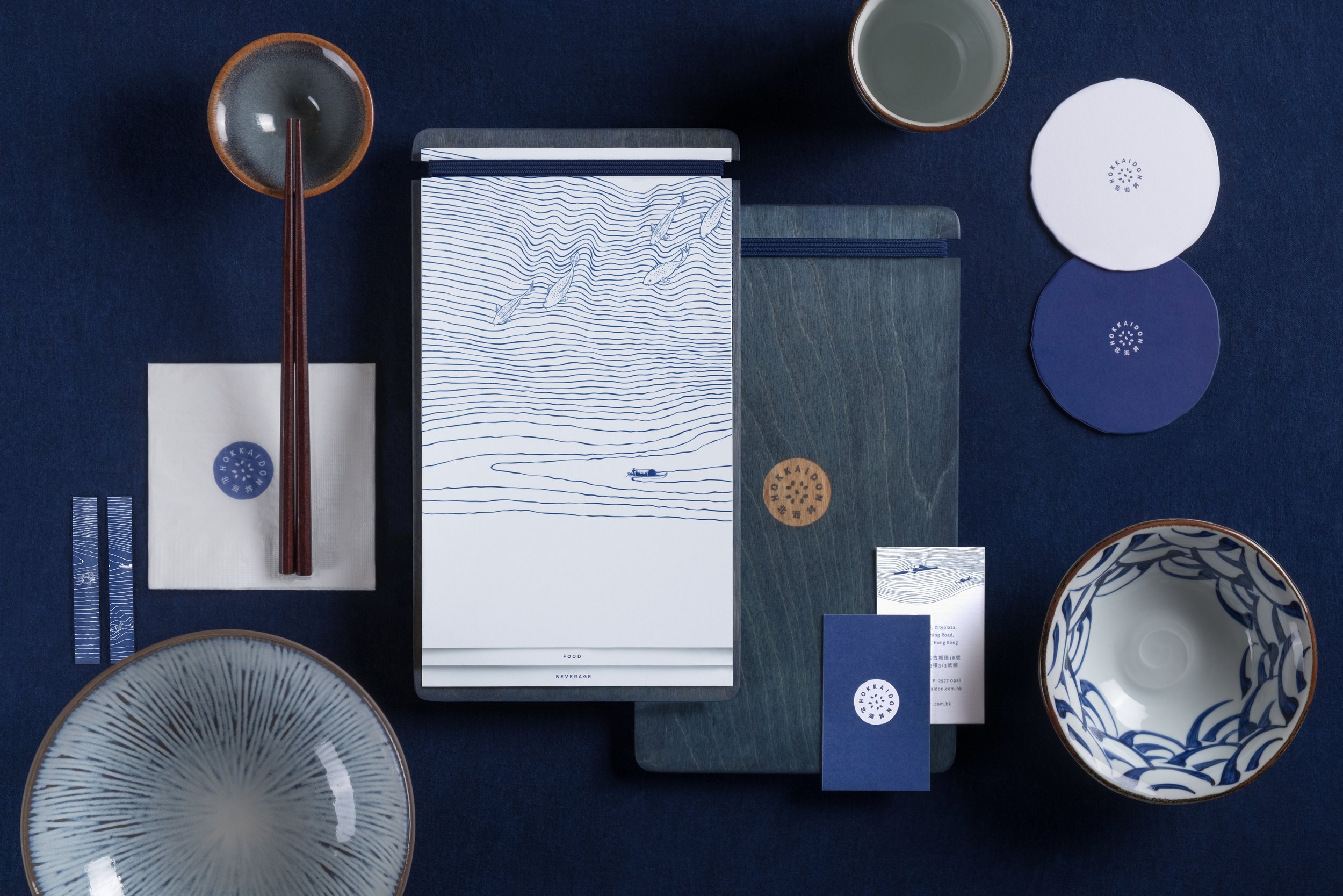
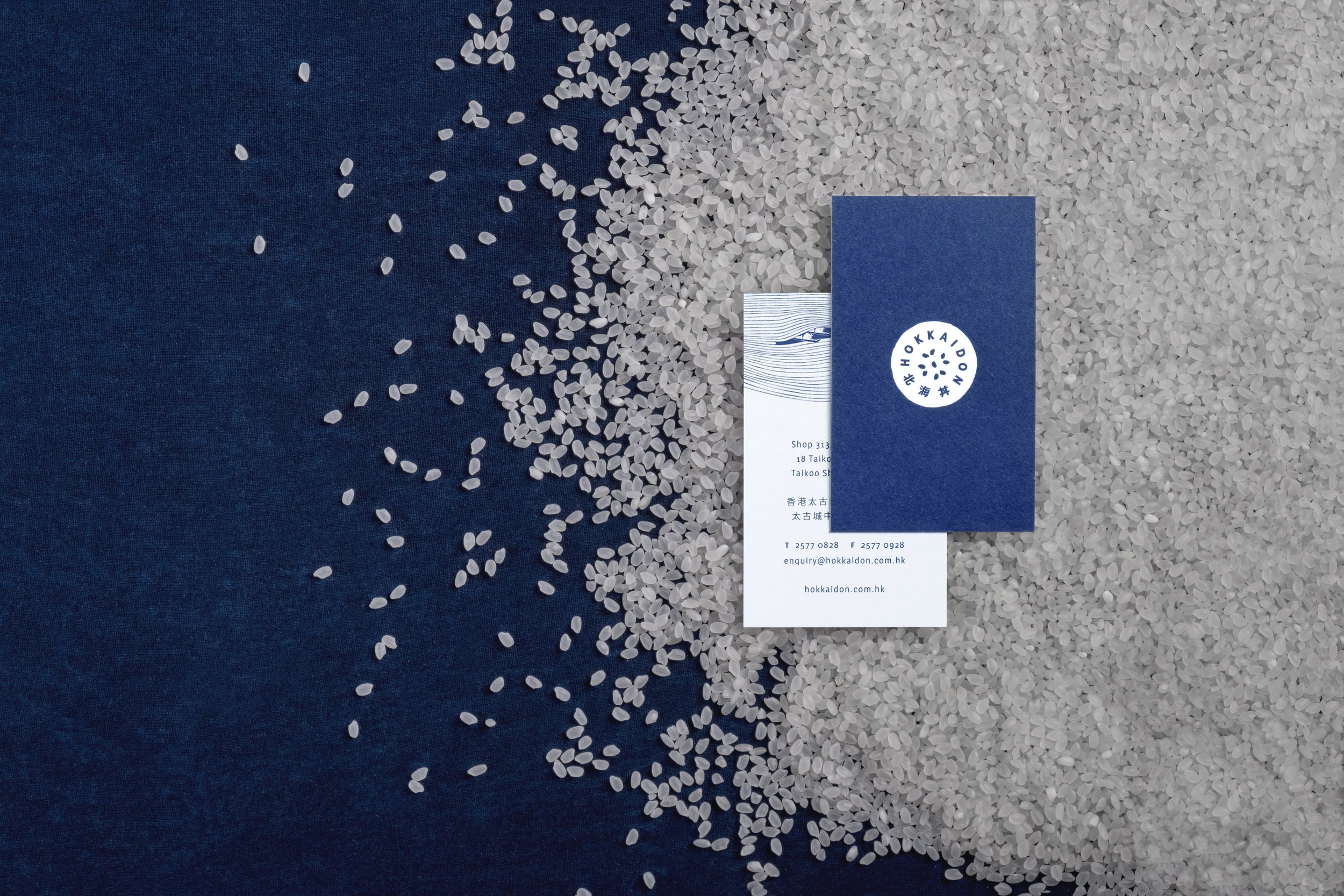
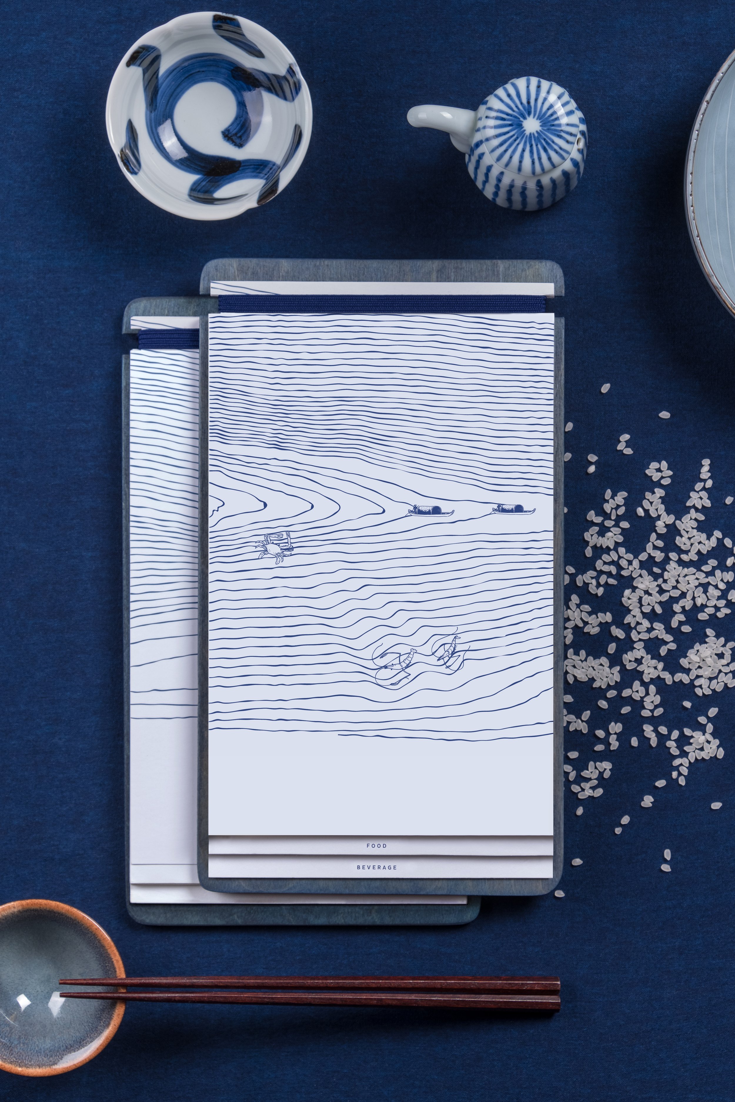
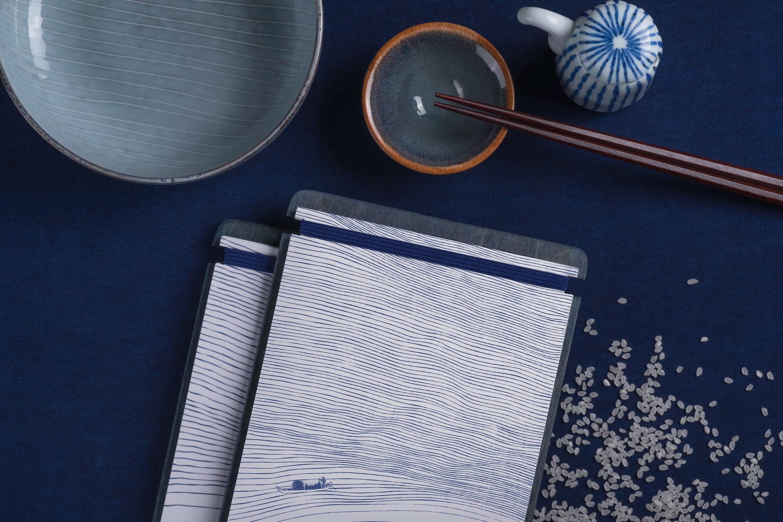
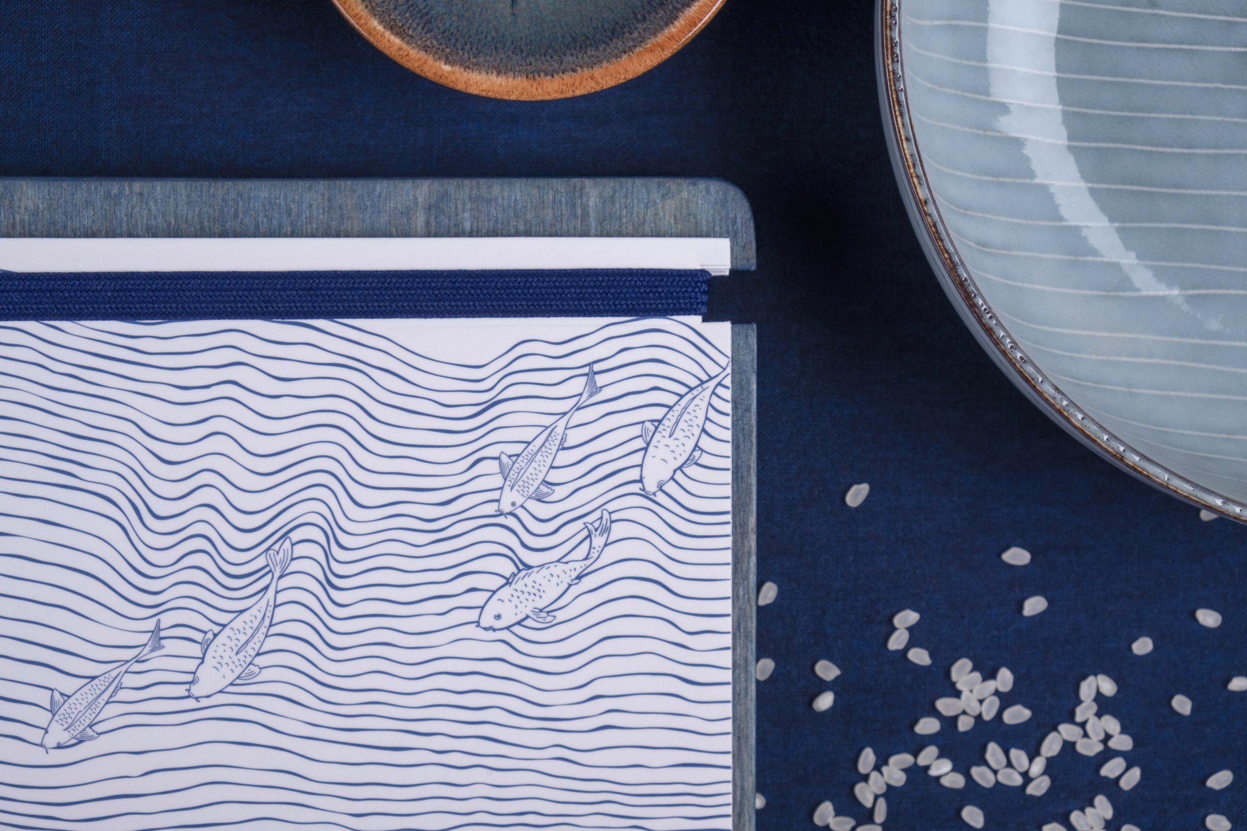
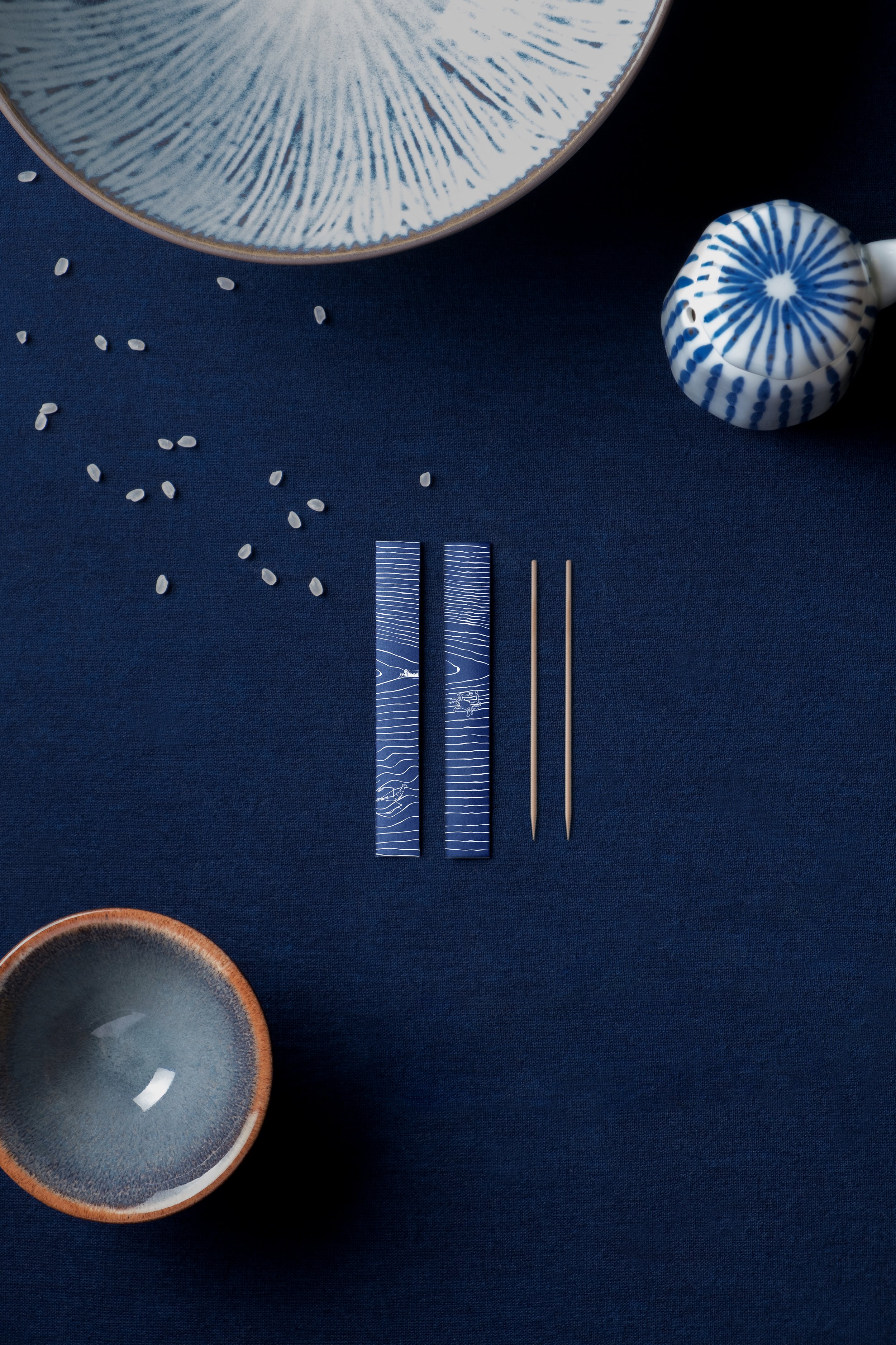
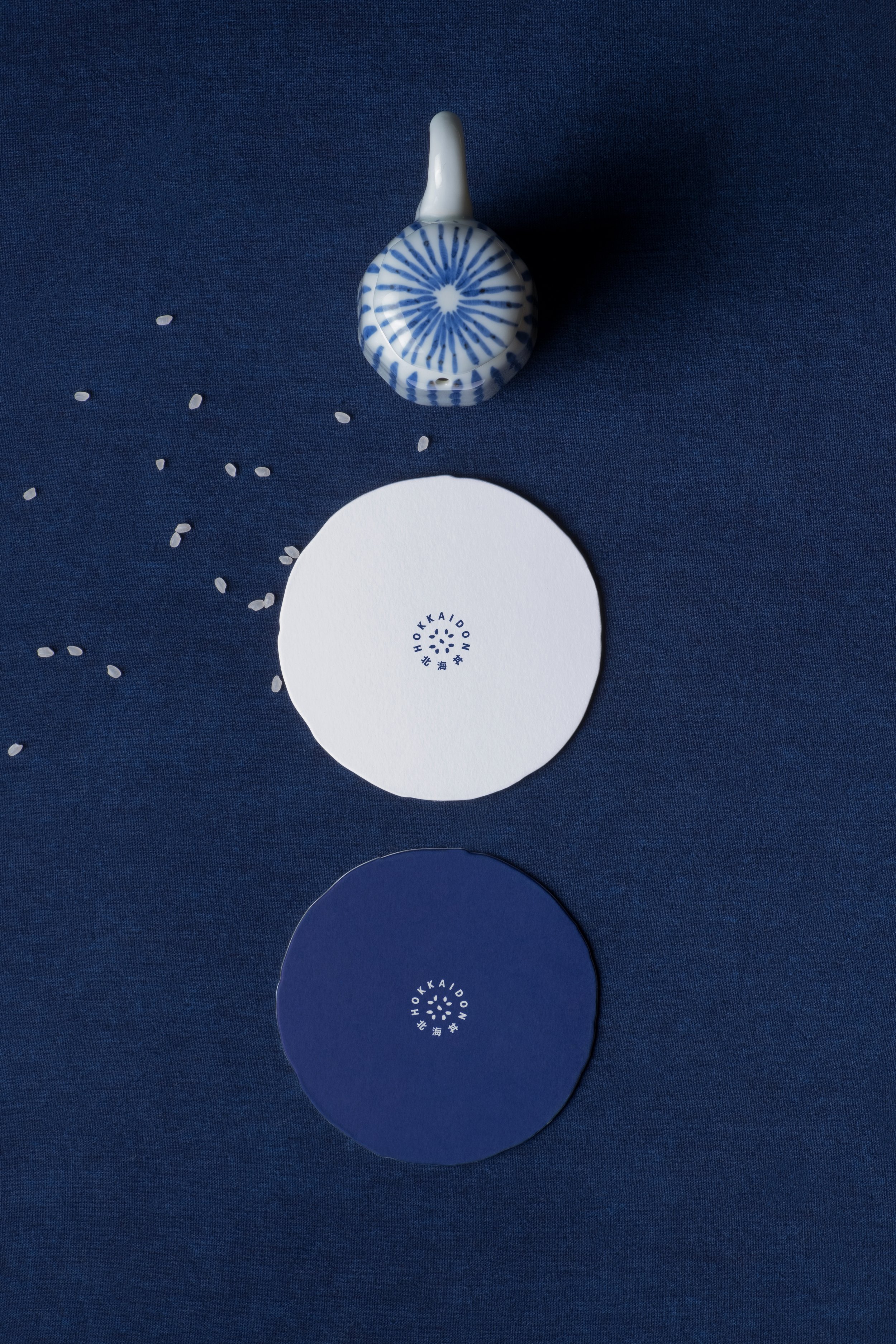
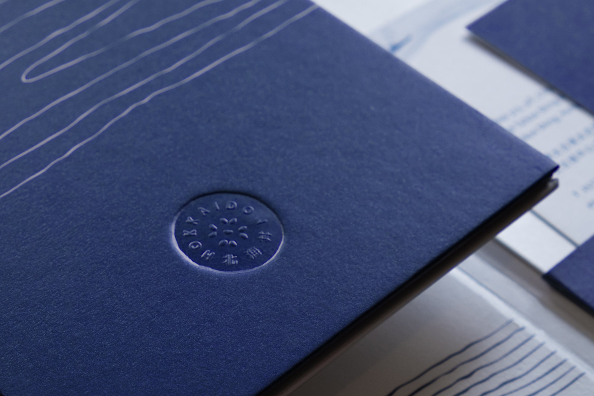
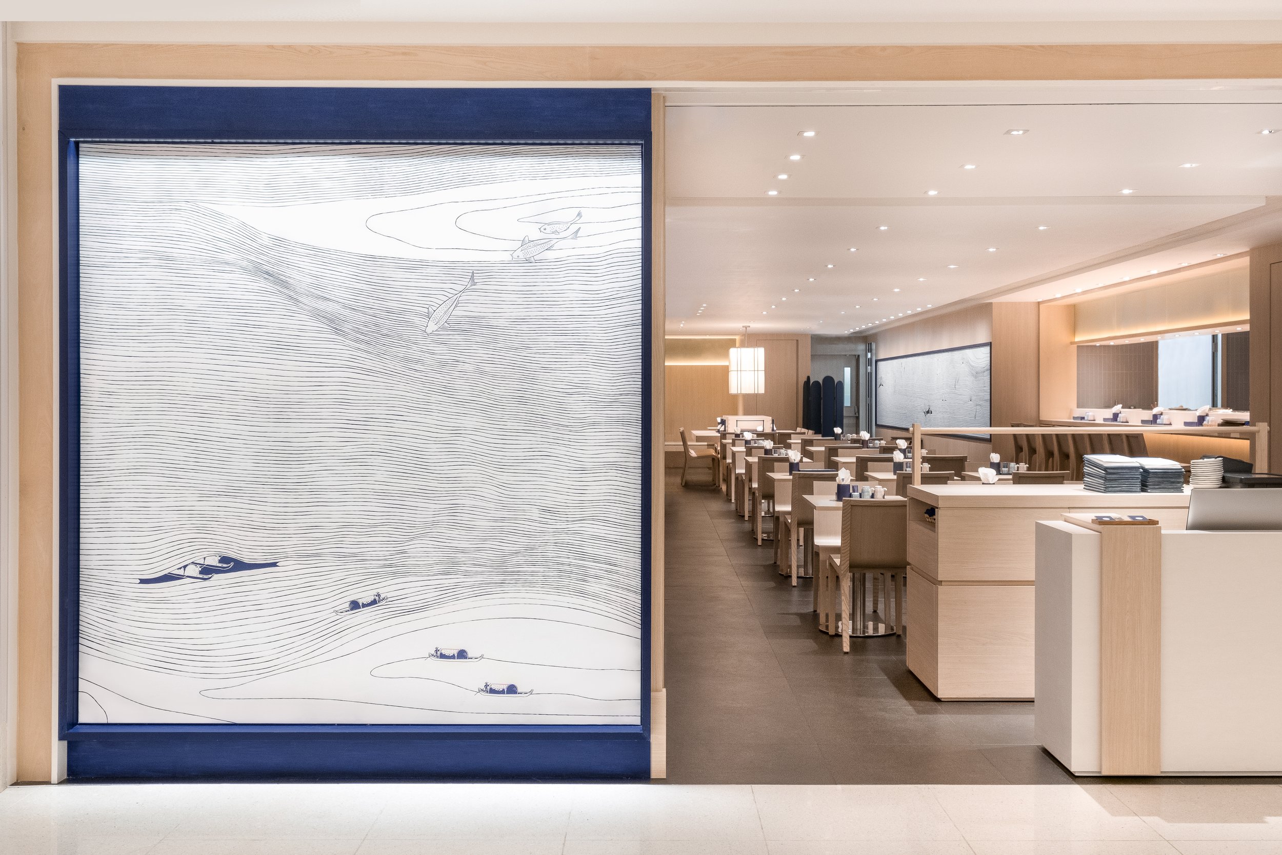
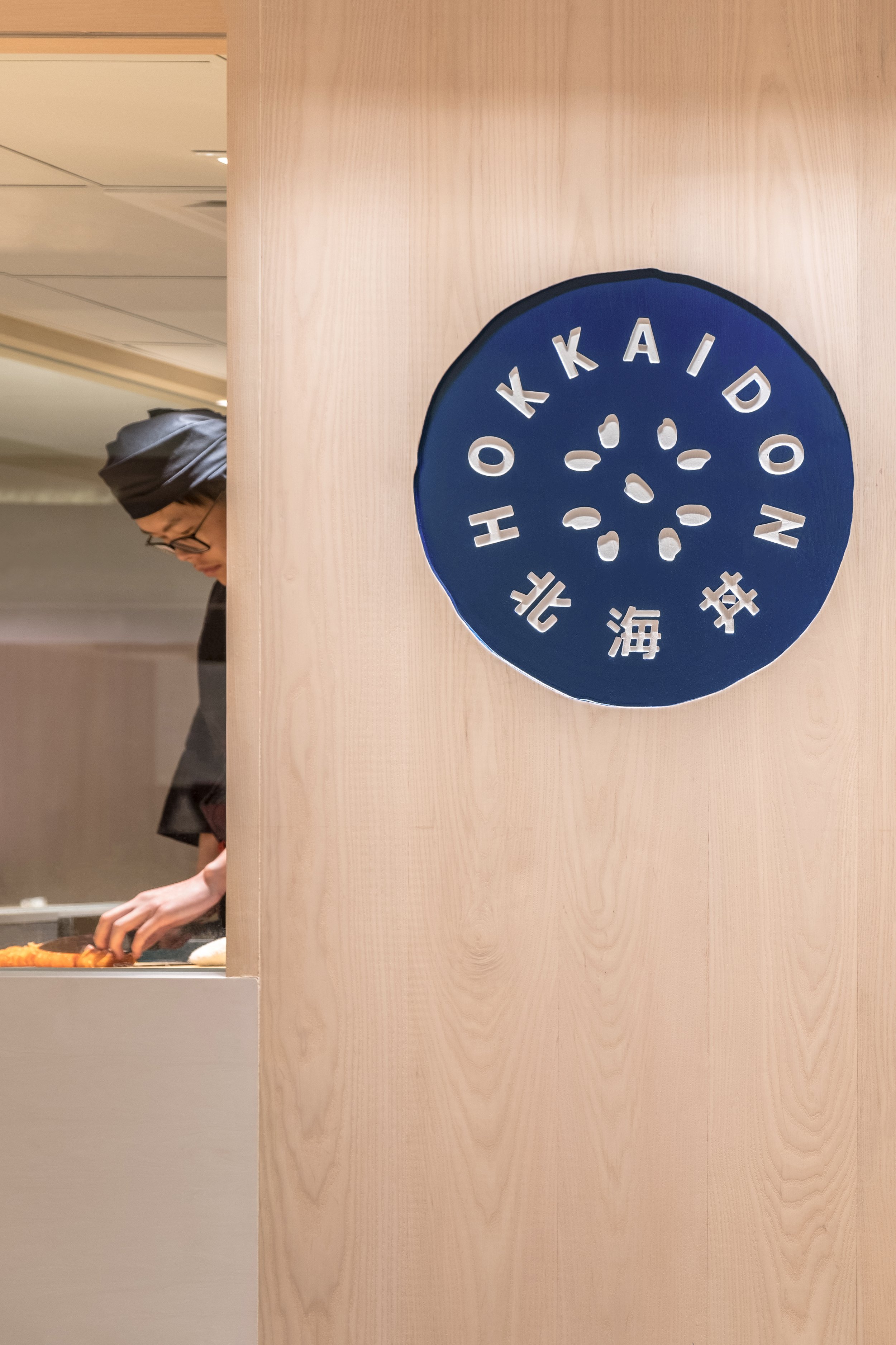
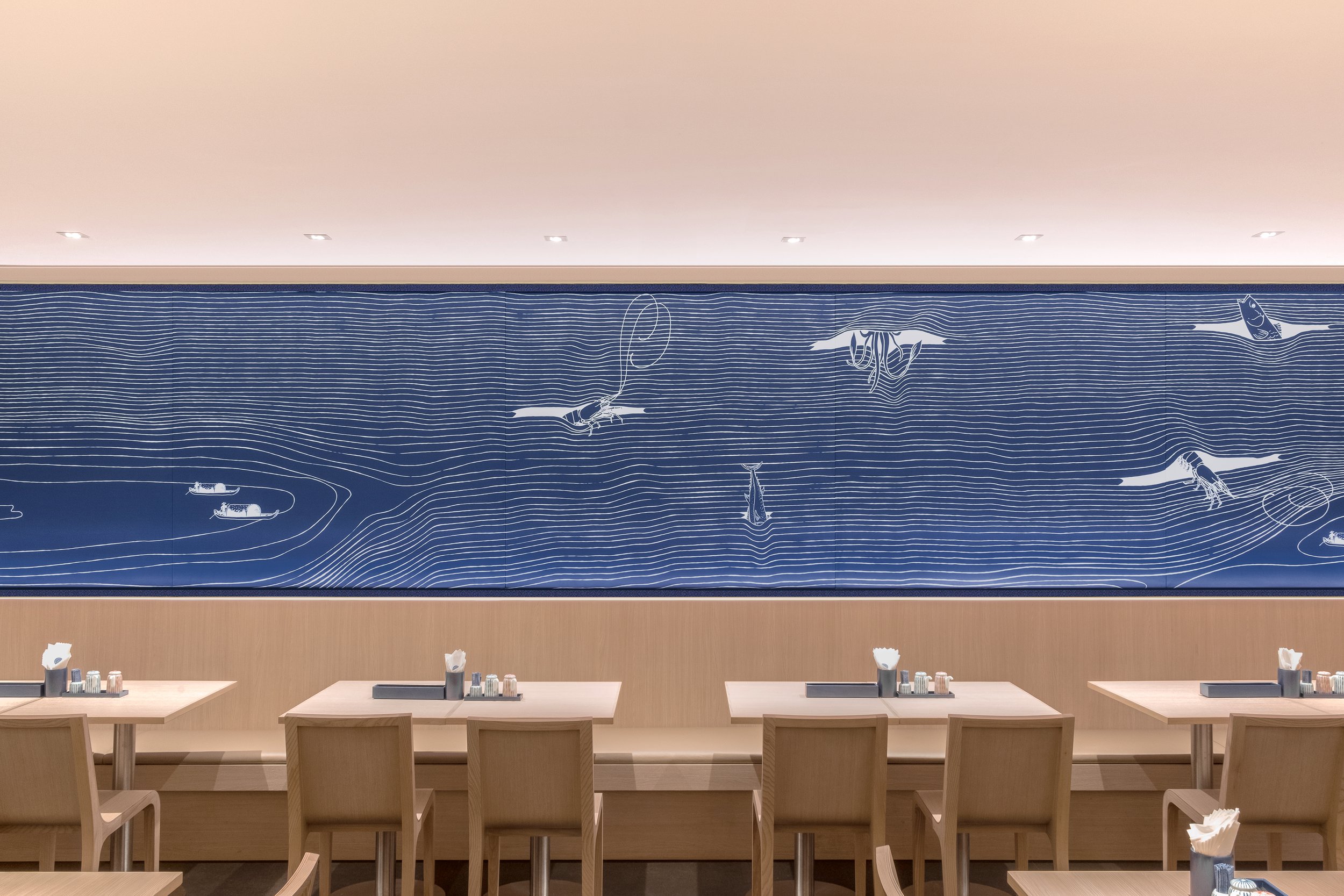
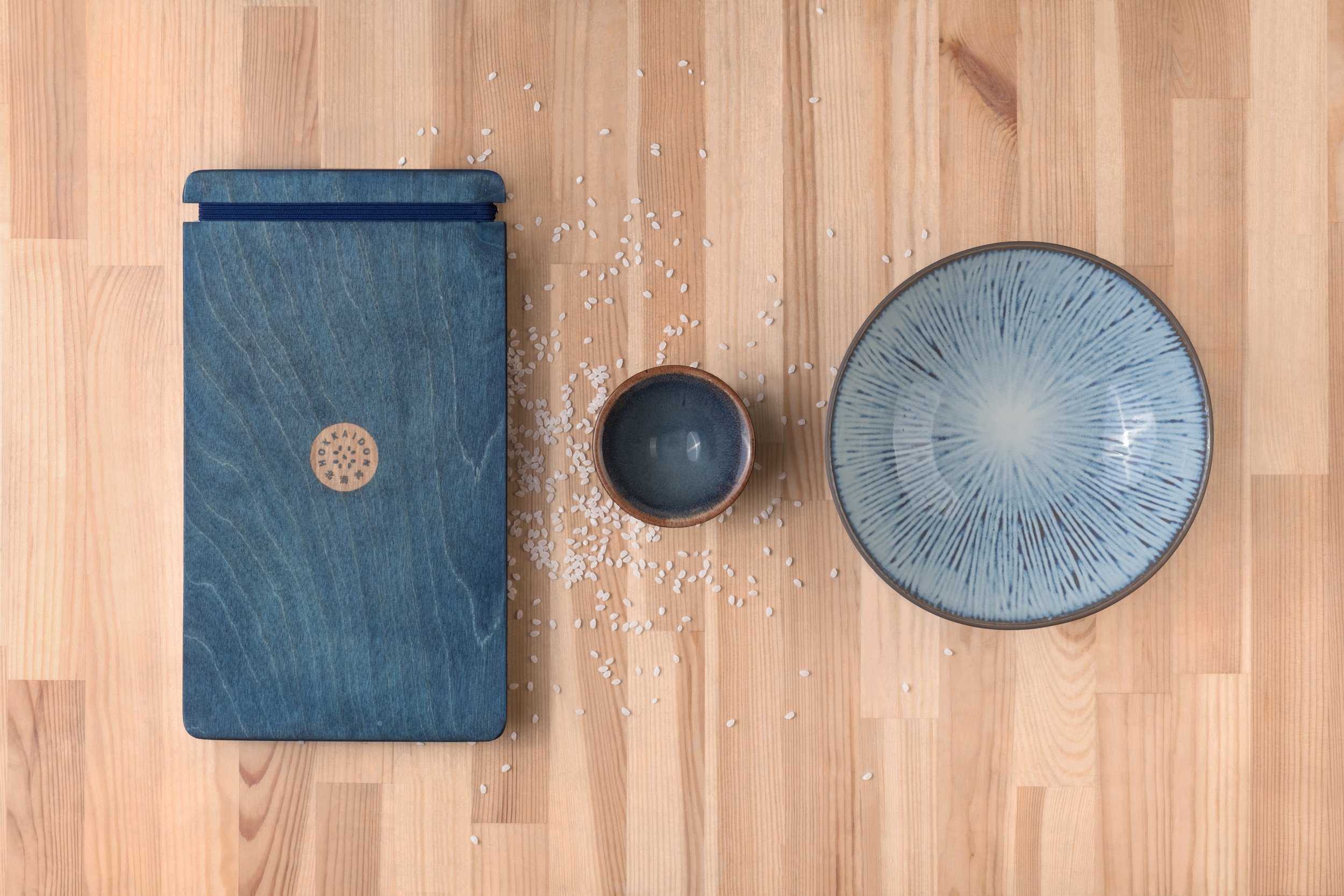
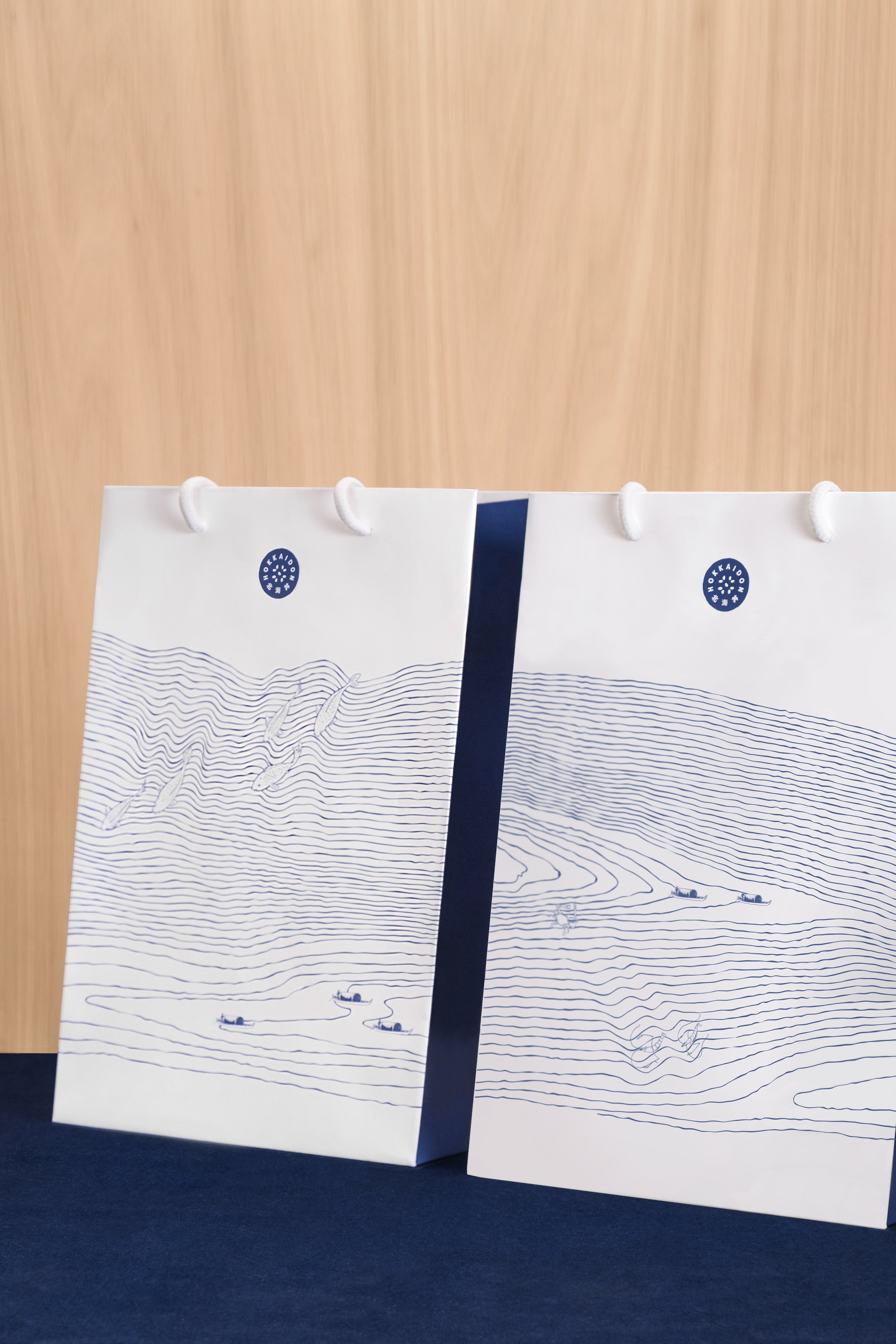
A unique take on a traditional motif, Hokkaidon’s graphic expression is a disruption of the tranquil pattern of Seigaiha, the instantly recognizable blue rolling waves. energy of the sea-to-table dishes unravels on the murals as an array of eclectic seafood break through the blue and white boundaries of the ocean, adding renewed vigor to this piece of Japanese heritage. rice, the foundation of Japanese food and culture, is at the core of the logo, creating a pure and distinct brand that reflects the essence of Chirashi.

Client: 1957 & Co.
Agency: A Work of Substance
Creative: Maxime Dautresme creative director, Judy Chen, Nelson Koe